备注
Go to the end 下载完整的示例代码.
修复过多的刻度#
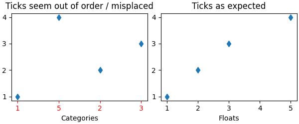
意外刻度行为的一个常见原因是传递字符串列表而不是数字或 datetime 对象.当读取逗号分隔的文本文件时,这很容易在没有注意到的情况下发生.Matplotlib 将字符串列表视为分类变量( 绘制分类变量 ),默认情况下,每个类别放置一个刻度,并按照它们被提供的顺序绘制它们.如果这不是期望的行为,解决方案是将字符串转换为数字类型,如以下示例所示.
示例 1:字符串可能导致数字刻度的意外顺序#
import matplotlib.pyplot as plt
import numpy as np

fig, ax = plt.subplots(1, 2, layout='constrained', figsize=(6, 2.5))
x = ['1', '5', '2', '3']
y = [1, 4, 2, 3]
ax[0].plot(x, y, 'd')
ax[0].tick_params(axis='x', color='r', labelcolor='r')
ax[0].set_xlabel('Categories')
ax[0].set_title('Ticks seem out of order / misplaced')

# convert to numbers:
x = np.asarray(x, dtype='float')
ax[1].plot(x, y, 'd')
ax[1].set_xlabel('Floats')
ax[1].set_title('Ticks as expected')
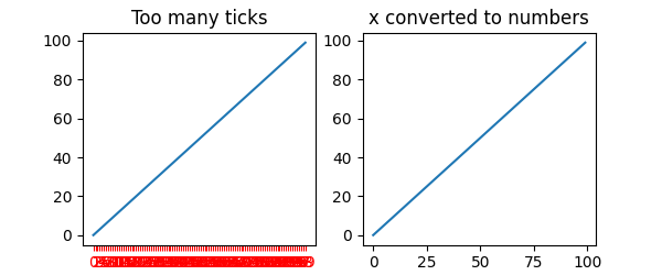
示例 2:字符串可能导致非常多的刻度#
如果 x 有 100 个元素,全部是字符串,那么我们将有 100 个(无法读取的)刻度,同样,解决方案是将字符串转换为浮点数:
fig, ax = plt.subplots(1, 2, figsize=(6, 2.5))
x = [f'{xx}' for xx in np.arange(100)]
y = np.arange(100)
ax[0].plot(x, y)
ax[0].tick_params(axis='x', color='r', labelcolor='r')
ax[0].set_title('Too many ticks')
ax[0].set_xlabel('Categories')

ax[1].plot(np.asarray(x, float), y)
ax[1].set_title('x converted to numbers')
ax[1].set_xlabel('Floats')
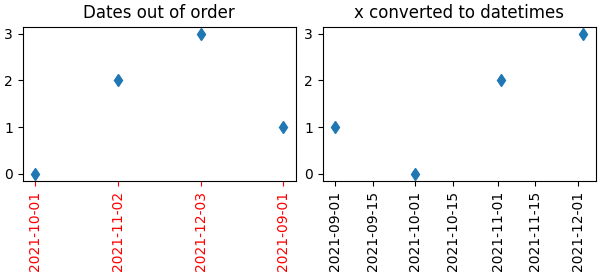
示例 3:字符串可能导致 datetime 刻度的意外顺序#
一个常见的情况是从 CSV 文件中读取日期,需要将它们从字符串转换为 datetime 对象,以获得正确的日期定位器和格式化器.
fig, ax = plt.subplots(1, 2, layout='constrained', figsize=(6, 2.75))
x = ['2021-10-01', '2021-11-02', '2021-12-03', '2021-09-01']
y = [0, 2, 3, 1]
ax[0].plot(x, y, 'd')
ax[0].tick_params(axis='x', labelrotation=90, color='r', labelcolor='r')
ax[0].set_title('Dates out of order')

# convert to datetime64
x = np.asarray(x, dtype='datetime64[s]')
ax[1].plot(x, y, 'd')
ax[1].tick_params(axis='x', labelrotation=90)
ax[1].set_title('x converted to datetimes')

plt.show()
脚本的总运行时间:(0 分钟 1.428 秒)