备注
Go to the end 下载完整的示例代码.
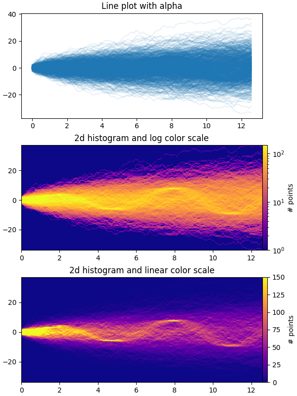
时间序列直方图#
此示例演示了如何有效地可视化大量时间序列,从而揭示隐藏的子结构和模式,并以视觉上吸引人的方式显示它们.
在此示例中,我们生成多个正弦"信号"序列,这些序列被埋藏在大量随机游走"噪声/背景"序列之下.对于标准偏差为 σ 的无偏高斯随机游走,n 步后与原点的 RMS 偏差为 σsqrt(n).因此,为了使正弦曲线在与随机游走相同的尺度上可见,我们通过随机游走 RMS 缩放幅度.此外,我们还引入了一个小的随机偏移 phi 来左右移动正弦波,并添加一些额外的随机噪声来上下移动各个数据点,以使信号更加"真实"(您不希望在数据中出现完美的正弦波).
第一个图显示了通过使用具有较小 alpha 值的 plt.plot 将多个时间序列叠加在一起的可视化方式.第二个和第三个图显示了如何通过使用 np.histogram2d 和 plt.pcolormesh 将数据重新解释为 2d 直方图,并可选地在数据点之间进行插值.
import time

import matplotlib.pyplot as plt
import numpy as np

fig, axes = plt.subplots(nrows=3, figsize=(6, 8), layout='constrained')

# Fix random state for reproducibility
np.random.seed(19680801)
# Make some data; a 1D random walk + small fraction of sine waves
num_series = 1000
num_points = 100
SNR = 0.10  # Signal to Noise Ratio
x = np.linspace(0, 4 * np.pi, num_points)
# Generate unbiased Gaussian random walks
Y = np.cumsum(np.random.randn(num_series, num_points), axis=-1)
# Generate sinusoidal signals
num_signal = round(SNR * num_series)
phi = (np.pi / 8) * np.random.randn(num_signal, 1)  # small random offset
Y[-num_signal:] = (
    np.sqrt(np.arange(num_points))  # random walk RMS scaling factor
    * (np.sin(x - phi)
       + 0.05 * np.random.randn(num_signal, num_points))  # small random noise
)


# Plot series using `plot` and a small value of `alpha`. With this view it is
# very difficult to observe the sinusoidal behavior because of how many
# overlapping series there are. It also takes a bit of time to run because so
# many individual artists need to be generated.
tic = time.time()
axes[0].plot(x, Y.T, color="C0", alpha=0.1)
toc = time.time()
axes[0].set_title("Line plot with alpha")
print(f"{toc-tic:.3f} sec. elapsed")


# Now we will convert the multiple time series into a histogram. Not only will
# the hidden signal be more visible, but it is also a much quicker procedure.
tic = time.time()
# Linearly interpolate between the points in each time series
num_fine = 800
x_fine = np.linspace(x.min(), x.max(), num_fine)
y_fine = np.concatenate([np.interp(x_fine, x, y_row) for y_row in Y])
x_fine = np.broadcast_to(x_fine, (num_series, num_fine)).ravel()


# Plot (x, y) points in 2d histogram with log colorscale
# It is pretty evident that there is some kind of structure under the noise
# You can tune vmax to make signal more visible
cmap = plt.colormaps["plasma"]
cmap = cmap.with_extremes(bad=cmap(0))
h, xedges, yedges = np.histogram2d(x_fine, y_fine, bins=[400, 100])
pcm = axes[1].pcolormesh(xedges, yedges, h.T, cmap=cmap,
                         norm="log", vmax=1.5e2, rasterized=True)
fig.colorbar(pcm, ax=axes[1], label="# points", pad=0)
axes[1].set_title("2d histogram and log color scale")

# Same data but on linear color scale
pcm = axes[2].pcolormesh(xedges, yedges, h.T, cmap=cmap,
                         vmax=1.5e2, rasterized=True)
fig.colorbar(pcm, ax=axes[2], label="# points", pad=0)
axes[2].set_title("2d histogram and linear color scale")

toc = time.time()
print(f"{toc-tic:.3f} sec. elapsed")
plt.show()
0.176 sec. elapsed
0.069 sec. elapsed
参考
以下函数,方法,类和模块的用法在本例中显示:
matplotlib.axes.Axes.pcolormesh/matplotlib.pyplot.pcolormeshmatplotlib.figure.Figure.colorbar
脚本的总运行时间:(0 分 2.523 秒)