备注
Go to the end 下载完整的示例代码.
刻度之间的中心标签#
刻度标签相对于其关联的刻度对齐.可以使用水平对齐属性控制对齐方式"center","left"或"right":
for label in ax.get_xticklabels():
    label.set_horizontalalignment('right')
但是,没有直接的方法可以将标签居中于刻度线之间.要伪造此行为,可以将标签放置在主刻度线之间的次刻度线上,并隐藏主刻度线标签和次刻度线.
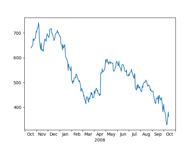
这是一个标记月份的示例,以刻度线为中心.
import matplotlib.pyplot as plt

import matplotlib.cbook as cbook
import matplotlib.dates as dates
import matplotlib.ticker as ticker

# Load some financial data; Google's stock price
r = cbook.get_sample_data('goog.npz')['price_data']
r = r[-250:]  # get the last 250 days

fig, ax = plt.subplots()
ax.plot(r["date"], r["adj_close"])

ax.xaxis.set_major_locator(dates.MonthLocator())
# 16 is a slight approximation since months differ in number of days.
ax.xaxis.set_minor_locator(dates.MonthLocator(bymonthday=16))

ax.xaxis.set_major_formatter(ticker.NullFormatter())
ax.xaxis.set_minor_formatter(dates.DateFormatter('%b'))

# Remove the tick lines
ax.tick_params(axis='x', which='minor', tick1On=False, tick2On=False)

# Align the minor tick label
for label in ax.get_xticklabels(minor=True):
    label.set_horizontalalignment('center')
imid = len(r) // 2
ax.set_xlabel(str(r["date"][imid].item().year))
plt.show()