备注
Go to the end 下载完整的示例代码.
直方图#
如何使用 Matplotlib 绘制直方图.
import matplotlib.pyplot as plt
import numpy as np

from matplotlib import colors
from matplotlib.ticker import PercentFormatter

# Create a random number generator with a fixed seed for reproducibility
rng = np.random.default_rng(19680801)
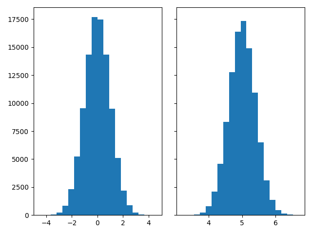
生成数据并绘制一个简单的直方图.#
要生成 1D 直方图,我们只需要一个数字向量. 对于 2D 直方图,我们将需要第二个向量. 我们将在下面生成这两个向量,并显示每个向量的直方图.
N_points = 100000
n_bins = 20

# Generate two normal distributions
dist1 = rng.standard_normal(N_points)
dist2 = 0.4 * rng.standard_normal(N_points) + 5

fig, axs = plt.subplots(1, 2, sharey=True, tight_layout=True)

# We can set the number of bins with the *bins* keyword argument.
axs[0].hist(dist1, bins=n_bins)
axs[1].hist(dist2, bins=n_bins)

plt.show()
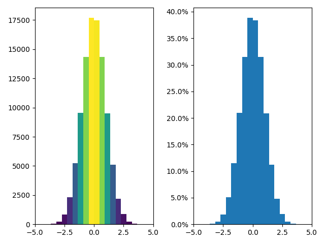
更新直方图颜色#
直方图方法( histogram method )会返回一个 patches 对象(以及其他).这使我们可以访问绘制对象的属性.使用此对象,我们可以根据自己的喜好编辑直方图.让我们根据每个条的 y 值来更改颜色.
fig, axs = plt.subplots(1, 2, tight_layout=True)

# N is the count in each bin, bins is the lower-limit of the bin
N, bins, patches = axs[0].hist(dist1, bins=n_bins)

# We'll color code by height, but you could use any scalar
fracs = N / N.max()

# we need to normalize the data to 0..1 for the full range of the colormap
norm = colors.Normalize(fracs.min(), fracs.max())

# Now, we'll loop through our objects and set the color of each accordingly
for thisfrac, thispatch in zip(fracs, patches):
    color = plt.cm.viridis(norm(thisfrac))
    thispatch.set_facecolor(color)

# We can also normalize our inputs by the total number of counts
axs[1].hist(dist1, bins=n_bins, density=True)

# Now we format the y-axis to display percentage
axs[1].yaxis.set_major_formatter(PercentFormatter(xmax=1))
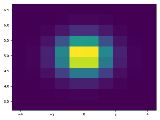
绘制 2D 直方图#
要绘制 2D 直方图,只需要两个长度相同的向量,分别对应于直方图的每个轴.
fig, ax = plt.subplots(tight_layout=True)
hist = ax.hist2d(dist1, dist2)
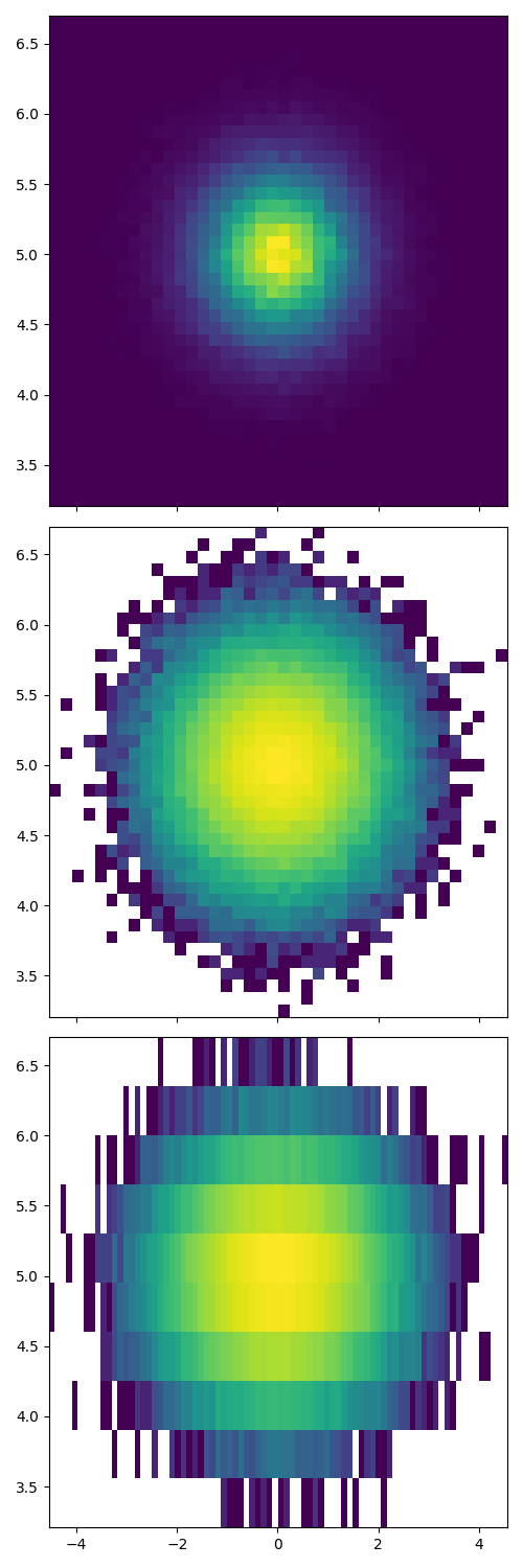
自定义你的直方图#
自定义 2D 直方图与 1D 情况类似,您可以控制视觉组件,例如 bin 大小或颜色归一化.
fig, axs = plt.subplots(3, 1, figsize=(5, 15), sharex=True, sharey=True,
                        tight_layout=True)

# We can increase the number of bins on each axis
axs[0].hist2d(dist1, dist2, bins=40)

# As well as define normalization of the colors
axs[1].hist2d(dist1, dist2, bins=40, norm=colors.LogNorm())

# We can also define custom numbers of bins for each axis
axs[2].hist2d(dist1, dist2, bins=(80, 10), norm=colors.LogNorm())
参考
以下函数,方法,类和模块的用法在本例中显示:
matplotlib.axes.Axes.hist/matplotlib.pyplot.histmatplotlib.pyplot.hist2dmatplotlib.ticker.PercentFormatter
脚本的总运行时间:(0 分 2.217 秒)