备注
Go to the end to download the full example code..
带有标签的柱状图#
此示例展示了如何使用 bar_label 辅助函数来创建柱状图标签.
另请参见 grouped bar , stacked bar 和 horizontal bar chart 示例.
import matplotlib.pyplot as plt
import numpy as np
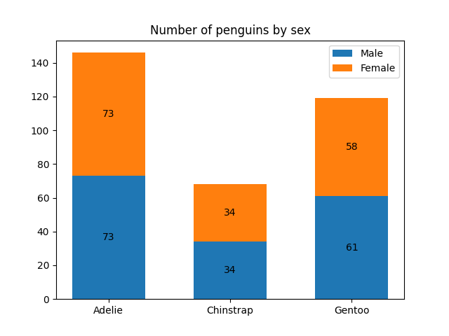
data from https://allisonhorst.github.io/palmerpenguins/
species = ('Adelie', 'Chinstrap', 'Gentoo')
sex_counts = {
    'Male': np.array([73, 34, 61]),
    'Female': np.array([73, 34, 58]),
}
width = 0.6  # the width of the bars: can also be len(x) sequence


fig, ax = plt.subplots()
bottom = np.zeros(3)

for sex, sex_count in sex_counts.items():
    p = ax.bar(species, sex_count, width, label=sex, bottom=bottom)
    bottom += sex_count

    ax.bar_label(p, label_type='center')

ax.set_title('Number of penguins by sex')
ax.legend()

plt.show()
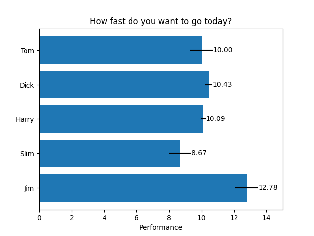
水平柱状图
# Fixing random state for reproducibility
np.random.seed(19680801)

# Example data
people = ('Tom', 'Dick', 'Harry', 'Slim', 'Jim')
y_pos = np.arange(len(people))
performance = 3 + 10 * np.random.rand(len(people))
error = np.random.rand(len(people))

fig, ax = plt.subplots()

hbars = ax.barh(y_pos, performance, xerr=error, align='center')
ax.set_yticks(y_pos, labels=people)
ax.invert_yaxis()  # labels read top-to-bottom
ax.set_xlabel('Performance')
ax.set_title('How fast do you want to go today?')

# Label with specially formatted floats
ax.bar_label(hbars, fmt='%.2f')
ax.set_xlim(right=15)  # adjust xlim to fit labels

plt.show()
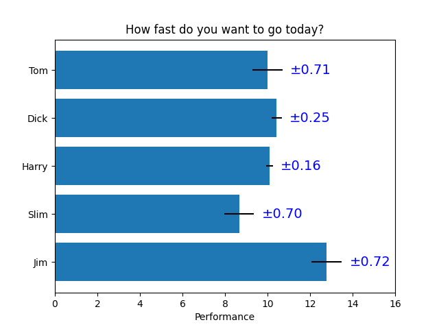
一些可以使用柱状标签完成的更高级的操作
fig, ax = plt.subplots()

hbars = ax.barh(y_pos, performance, xerr=error, align='center')
ax.set_yticks(y_pos, labels=people)
ax.invert_yaxis()  # labels read top-to-bottom
ax.set_xlabel('Performance')
ax.set_title('How fast do you want to go today?')

# Label with given captions, custom padding and annotate options
ax.bar_label(hbars, labels=[f'±{e:.2f}' for e in error],
             padding=8, color='b', fontsize=14)
ax.set_xlim(right=16)

plt.show()
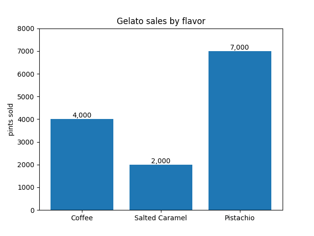
使用{}-style 格式字符串的柱状标签
fruit_names = ['Coffee', 'Salted Caramel', 'Pistachio']
fruit_counts = [4000, 2000, 7000]

fig, ax = plt.subplots()
bar_container = ax.bar(fruit_names, fruit_counts)
ax.set(ylabel='pints sold', title='Gelato sales by flavor', ylim=(0, 8000))
ax.bar_label(bar_container, fmt='{:,.0f}')
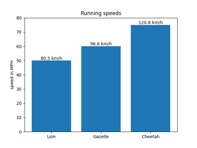
使用可调用对象的柱状标签
animal_names = ['Lion', 'Gazelle', 'Cheetah']
mph_speed = [50, 60, 75]

fig, ax = plt.subplots()
bar_container = ax.bar(animal_names, mph_speed)
ax.set(ylabel='speed in MPH', title='Running speeds', ylim=(0, 80))
ax.bar_label(bar_container, fmt=lambda x: f'{x * 1.61:.1f} km/h')
参考
以下函数,方法,类和模块的用法在本例中显示:
matplotlib.axes.Axes.bar/matplotlib.pyplot.barmatplotlib.axes.Axes.barh/matplotlib.pyplot.barhmatplotlib.axes.Axes.bar_label/matplotlib.pyplot.bar_label
Total running time of the script: (0 minutes 1.176 seconds)