备注
Go to the end 以下载完整的示例代码.
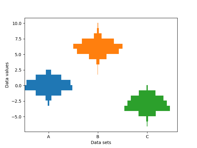
并排显示多个直方图#
此示例绘制了沿类别 x 轴的不同样本的水平直方图.此外,绘制的直方图关于其 x 位置对称,因此使它们与小提琴图非常相似.
为了制作这种高度专业化的绘图,我们不能使用标准的 hist 方法. 相反,我们使用 barh 直接绘制水平条. 条的垂直位置和长度通过 np.histogram 函数计算. 使用相同的范围(最小值和最大值)和 bin 数计算所有样本的直方图,以便每个样本的 bin 处于相同的垂直位置.
选择不同的 bin 计数和大小会显着影响直方图的形状. Astropy 文档中有一个很棒的章节,介绍了如何选择这些参数:http://docs.astropy.org/en/stable/visualization/histogram.html
import matplotlib.pyplot as plt
import numpy as np

np.random.seed(19680801)
number_of_bins = 20

# An example of three data sets to compare
number_of_data_points = 387
labels = ["A", "B", "C"]
data_sets = [np.random.normal(0, 1, number_of_data_points),
             np.random.normal(6, 1, number_of_data_points),
             np.random.normal(-3, 1, number_of_data_points)]

# Computed quantities to aid plotting
hist_range = (np.min(data_sets), np.max(data_sets))
binned_data_sets = [
    np.histogram(d, range=hist_range, bins=number_of_bins)[0]
    for d in data_sets
]
binned_maximums = np.max(binned_data_sets, axis=1)
x_locations = np.arange(0, sum(binned_maximums), np.max(binned_maximums))

# The bin_edges are the same for all of the histograms
bin_edges = np.linspace(hist_range[0], hist_range[1], number_of_bins + 1)
heights = np.diff(bin_edges)
centers = bin_edges[:-1] + heights / 2

# Cycle through and plot each histogram
fig, ax = plt.subplots()
for x_loc, binned_data in zip(x_locations, binned_data_sets):
    lefts = x_loc - 0.5 * binned_data
    ax.barh(centers, binned_data, height=heights, left=lefts)

ax.set_xticks(x_locations, labels)

ax.set_ylabel("Data values")
ax.set_xlabel("Data sets")

plt.show()
参考
以下函数,方法,类和模块的用法在本例中显示:
matplotlib.axes.Axes.barh/matplotlib.pyplot.barh