备注
Go to the end 下载完整的示例代码.
图像重采样#
图像由离散的像素表示,这些像素被分配了颜色值,无论是在屏幕上还是在图像文件中.当用户使用数据数组调用 imshow 时,数据数组的大小很少与图形中分配给图像的像素数量完全匹配,因此 Matplotlib 会对数据或图像进行重采样或 scales 以进行适配.如果数据数组大于渲染图形中分配的像素数量,则图像将被"降采样"并且图像信息将丢失.相反,如果数据数组小于输出像素的数量,那么每个数据点将获得多个像素,并且图像被"升采样".
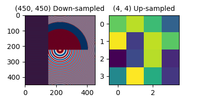
在下面的图中,第一个数据数组的大小为 (450, 450),但在图中用更少的像素表示,因此被降采样.第二个数据数组的大小为 (4, 4),用更多的像素来表示,因此被升采样.
import matplotlib.pyplot as plt
import numpy as np

fig, axs = plt.subplots(1, 2, figsize=(4, 2))

# First we generate a 450x450 pixel image with varying frequency content:
N = 450
x = np.arange(N) / N - 0.5
y = np.arange(N) / N - 0.5
aa = np.ones((N, N))
aa[::2, :] = -1

X, Y = np.meshgrid(x, y)
R = np.sqrt(X**2 + Y**2)
f0 = 5
k = 100
a = np.sin(np.pi * 2 * (f0 * R + k * R**2 / 2))
# make the left hand side of this
a[:int(N / 2), :][R[:int(N / 2), :] < 0.4] = -1
a[:int(N / 2), :][R[:int(N / 2), :] < 0.3] = 1
aa[:, int(N / 3):] = a[:, int(N / 3):]
alarge = aa

axs[0].imshow(alarge, cmap='RdBu_r')
axs[0].set_title('(450, 450) Down-sampled', fontsize='medium')

np.random.seed(19680801+9)
asmall = np.random.rand(4, 4)
axs[1].imshow(asmall, cmap='viridis')
axs[1].set_title('(4, 4) Up-sampled', fontsize='medium')
Matplotlib 的 imshow 方法有两个关键字参数,允许用户控制如何进行重采样.interpolation 关键字参数允许选择用于重采样的内核,允许在降采样时进行 anti-alias 滤波,或者在升采样时进行像素平滑.interpolation_stage 关键字参数,决定这个平滑内核是应用于底层数据,还是应用于 RGBA 像素.
interpolation_stage='rgba' : 数据 -> 归一化 -> RGBA -> 插值/重采样
interpolation_stage='data' : 数据 -> 插值/重采样 -> 归一化 -> RGBA
对于这两个关键字参数,Matplotlib 都有一个默认的"抗锯齿"设置,建议在大多数情况下使用,如下所述.请注意,如果图像被降采样或升采样,此默认行为会有所不同,如下所述.
降采样和适度升采样#
当对数据进行降采样时,我们通常希望通过先平滑图像然后再对其进行二次采样来消除锯齿.在 Matplotlib 中,我们可以在将数据映射到颜色之前进行平滑处理,或者我们可以在 RGB(A) 图像像素上进行平滑处理.这些差异如下所示,并通过 interpolation_stage 关键字参数控制.
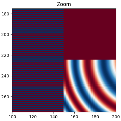
以下图像从 450 个数据像素降采样到大约 125 个像素或 250 个像素(取决于您的显示器).底层图像的左侧具有交替的 +1,-1 条纹,其余图像具有变化的波长( chirp )模式.如果我们放大,我们可以看到这个细节,而没有任何降采样:
fig, ax = plt.subplots(figsize=(4, 4), layout='compressed')
ax.imshow(alarge, interpolation='nearest', cmap='RdBu_r')
ax.set_xlim(100, 200)
ax.set_ylim(275, 175)
ax.set_title('Zoom')
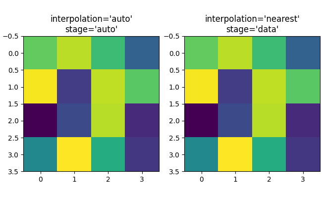
如果我们进行降采样,最简单的算法是使用 nearest-neighbor interpolation 来抽取数据.我们可以在数据空间或 RGBA 空间中执行此操作:
fig, axs = plt.subplots(1, 2, figsize=(5, 2.7), layout='compressed')
for ax, interp, space in zip(axs.flat, ['nearest', 'nearest'],
                                       ['data', 'rgba']):
    ax.imshow(alarge, interpolation=interp, interpolation_stage=space,
              cmap='RdBu_r')
    ax.set_title(f"interpolation='{interp}'\nstage='{space}'")
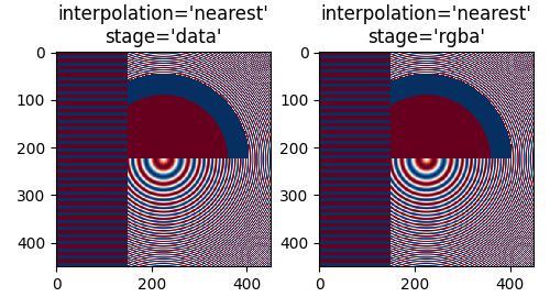
最近邻插值在数据和 RGBA 空间中是相同的,并且都表现出 Moiré 图案,因为高频数据被降采样并显示为较低频率的图案. 我们可以通过在渲染之前将抗锯齿滤波器应用于图像来减少莫尔图案:
fig, axs = plt.subplots(1, 2, figsize=(5, 2.7), layout='compressed')
for ax, interp, space in zip(axs.flat, ['hanning', 'hanning'],
                                       ['data', 'rgba']):
    ax.imshow(alarge, interpolation=interp, interpolation_stage=space,
              cmap='RdBu_r')
    ax.set_title(f"interpolation='{interp}'\nstage='{space}'")
plt.show()
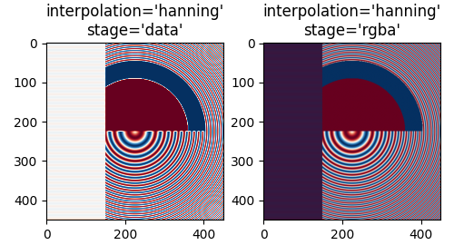
Hanning 滤波器平滑了底层数据,因此每个新像素都是原始底层像素的加权平均值.这大大减少了莫尔图案.但是,当 interpolation_stage 设置为"data"时,它还在图像中引入了原始数据中没有的白色区域,无论是在图像左侧的交替条带中,还是在图像中间大圆圈的红色和蓝色之间的边界中."rgba"阶段的插值有一个不同的伪像,交替的条带呈现出紫色阴影;即使紫色不在原始的颜色映射中,但当蓝色和红色条纹彼此靠近时,我们也会感知到紫色.
interpolation 关键字参数的默认值是 'auto',如果图像的降采样或升采样的倍数小于 3,则会选择 Hanning 滤波器.默认的 interpolation_stage 关键字参数也是 'auto',对于降采样或升采样倍数小于 3 的图像,它默认为 'rgba' 插值.
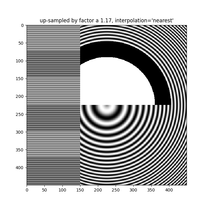
即使在升采样时,也需要抗锯齿滤波.下面的图像将 450 个数据像素升采样到 530 个渲染像素.您可能会注意到一个线状伪影网格,它源于必须创建的额外像素.由于插值为"nearest",它们与相邻的像素行相同,因此局部拉伸图像,使其看起来失真.
fig, ax = plt.subplots(figsize=(6.8, 6.8))
ax.imshow(alarge, interpolation='nearest', cmap='grey')
ax.set_title("up-sampled by factor a 1.17, interpolation='nearest'")
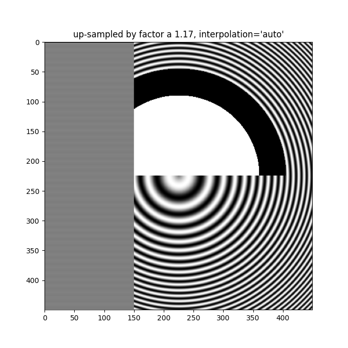
更好的抗锯齿算法可以减少这种影响:
fig, ax = plt.subplots(figsize=(6.8, 6.8))
ax.imshow(alarge, interpolation='auto', cmap='grey')
ax.set_title("up-sampled by factor a 1.17, interpolation='auto'")
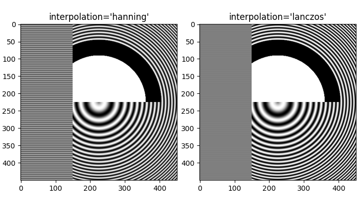
除了默认的 'hanning' 抗锯齿, imshow 还支持许多不同的插值算法,这些算法的效果可能会因底层数据而异.
fig, axs = plt.subplots(1, 2, figsize=(7, 4), layout='constrained')
for ax, interp in zip(axs, ['hanning', 'lanczos']):
    ax.imshow(alarge, interpolation=interp, cmap='gray')
    ax.set_title(f"interpolation='{interp}'")
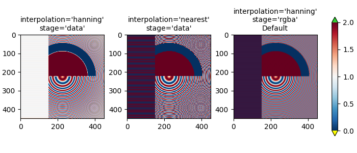
最后一个例子展示了在使用非平凡插值核时,在 RGBA 阶段执行抗锯齿处理的必要性.在下面的例子中,最上面 100 行的数据正好是 0.0,而内圆的数据正好是 2.0.如果我们在"数据"空间中执行 interpolation_stage 并使用抗锯齿滤波器(第一个面板),那么浮点精度误差会使一些数据值略小于零或略大于 2.0,并且它们会被分配为欠色或过色.如果您不使用抗锯齿滤波器(interpolation 设置为"nearest"),则可以避免这种情况,但是,这会使数据中容易出现莫尔条纹的部分变得更糟(第二个面板).因此,我们建议对于大多数降采样情况,使用默认的插值 'hanning'/'auto' 和 interpolation_stage 'rgba'/'auto'(最后一个面板).
a = alarge + 1
cmap = plt.get_cmap('RdBu_r')
cmap.set_under('yellow')
cmap.set_over('limegreen')

fig, axs = plt.subplots(1, 3, figsize=(7, 3), layout='constrained')
for ax, interp, space in zip(axs.flat,
                             ['hanning', 'nearest', 'hanning', ],
                             ['data', 'data', 'rgba']):
    im = ax.imshow(a, interpolation=interp, interpolation_stage=space,
                   cmap=cmap, vmin=0, vmax=2)
    title = f"interpolation='{interp}'\nstage='{space}'"
    if ax == axs[2]:
        title += '\nDefault'
    ax.set_title(title, fontsize='medium')
fig.colorbar(im, ax=axs, extend='both', shrink=0.8)
升采样#
如果我们进行升采样,那么我们可以用许多图像或屏幕像素来表示一个数据像素.在下面的例子中,我们对小数据矩阵进行了大量的过采样.
np.random.seed(19680801+9)
a = np.random.rand(4, 4)

fig, axs = plt.subplots(1, 2, figsize=(6.5, 4), layout='compressed')
axs[0].imshow(asmall, cmap='viridis')
axs[0].set_title("interpolation='auto'\nstage='auto'")
axs[1].imshow(asmall, cmap='viridis', interpolation="nearest",
              interpolation_stage="data")
axs[1].set_title("interpolation='nearest'\nstage='data'")
plt.show()
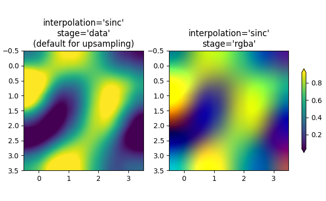
如果需要,可以使用 interpolation 关键字参数来平滑像素.然而,几乎总是在数据空间中进行这种操作更好,而不是在 RGBA 空间中进行,因为在 RGBA 空间中,滤波器可能会导致不在颜色映射中的颜色成为插值的结果.在下面的例子中,请注意当插值为"rgba"时,插值伪影中存在红色.因此,当升采样大于 3 倍时,interpolation_stage 的默认"auto"选择被设置为与"data"相同:
fig, axs = plt.subplots(1, 2, figsize=(6.5, 4), layout='compressed')
im = axs[0].imshow(a, cmap='viridis', interpolation='sinc', interpolation_stage='data')
axs[0].set_title("interpolation='sinc'\nstage='data'\n(default for upsampling)")
axs[1].imshow(a, cmap='viridis', interpolation='sinc', interpolation_stage='rgba')
axs[1].set_title("interpolation='sinc'\nstage='rgba'")
fig.colorbar(im, ax=axs, shrink=0.7, extend='both')
避免重采样#
在制作图像时,可以避免重采样数据.一种方法是简单地保存到矢量后端(pdf,eps,svg)并使用 interpolation='none' .矢量后端允许嵌入图像,但请注意,某些矢量图像查看器可能会平滑图像像素.
第二种方法是将您的坐标轴大小与您的数据大小完全匹配.下图正好是 2 英寸乘 2 英寸,如果 dpi 为 200,则 400x400 的数据根本不会被重采样.如果您下载这张图像并在图像查看器中放大,您应该看到左侧的各个条纹(请注意,如果您有一个非 hiDPI 或"retina"屏幕,html 可能会提供 100x100 版本的图像,该图像将被降采样.)
fig = plt.figure(figsize=(2, 2))
ax = fig.add_axes([0, 0, 1, 1])
ax.imshow(aa[:400, :400], cmap='RdBu_r', interpolation='nearest')
plt.show()
参考
以下函数,方法,类和模块的用法在本例中显示:
matplotlib.axes.Axes.imshow
脚本的总运行时间:(0 分 7.249 秒)