备注
Go to the end 下载完整的示例代码.
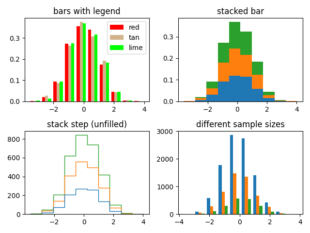
带有多个数据集的直方图(hist)函数#
绘制具有多个样本集的直方图并演示:
将图例与多个样本集结合使用
堆叠条形
没有填充的阶跃曲线
不同样本大小的数据集
选择不同的 bin 计数和大小会显着影响直方图的形状. Astropy 文档中有一个很棒的章节,介绍了如何选择这些参数:http://docs.astropy.org/en/stable/visualization/histogram.html
import matplotlib.pyplot as plt
import numpy as np

np.random.seed(19680801)

n_bins = 10
x = np.random.randn(1000, 3)

fig, ((ax0, ax1), (ax2, ax3)) = plt.subplots(nrows=2, ncols=2)

colors = ['red', 'tan', 'lime']
ax0.hist(x, n_bins, density=True, histtype='bar', color=colors, label=colors)
ax0.legend(prop={'size': 10})
ax0.set_title('bars with legend')

ax1.hist(x, n_bins, density=True, histtype='bar', stacked=True)
ax1.set_title('stacked bar')

ax2.hist(x, n_bins, histtype='step', stacked=True, fill=False)
ax2.set_title('stack step (unfilled)')

# Make a multiple-histogram of data-sets with different length.
x_multi = [np.random.randn(n) for n in [10000, 5000, 2000]]
ax3.hist(x_multi, n_bins, histtype='bar')
ax3.set_title('different sample sizes')

fig.tight_layout()
plt.show()
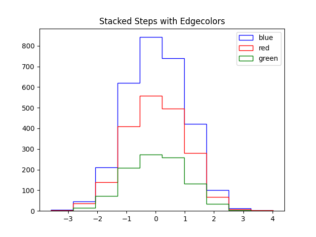
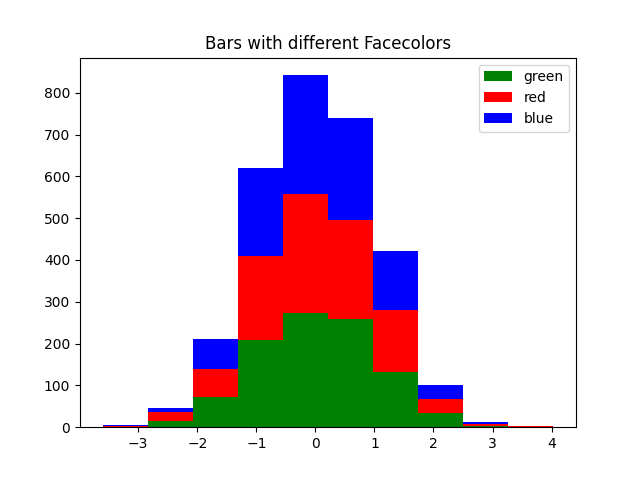
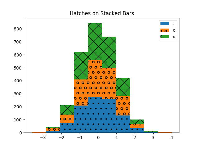
设置每个数据集的属性#
您可以通过将值的列表传递给以下参数来单独设置直方图的样式:
edgecolor
facecolor
hatch
linewidth
linestyle
edgecolor#
fig, ax = plt.subplots()

edgecolors = ['green', 'red', 'blue']

ax.hist(x, n_bins, fill=False, histtype="step", stacked=True,
        edgecolor=edgecolors, label=edgecolors)
ax.legend()
ax.set_title('Stacked Steps with Edgecolors')

plt.show()
facecolor#
fig, ax = plt.subplots()

facecolors = ['green', 'red', 'blue']

ax.hist(x, n_bins, histtype="barstacked", facecolor=facecolors, label=facecolors)
ax.legend()
ax.set_title("Bars with different Facecolors")

plt.show()
hatch#
fig, ax = plt.subplots()

hatches = [".", "o", "x"]

ax.hist(x, n_bins, histtype="barstacked", hatch=hatches, label=hatches)
ax.legend()
ax.set_title("Hatches on Stacked Bars")

plt.show()
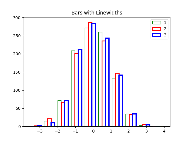
linewidth#
fig, ax = plt.subplots()

linewidths = [1, 2, 3]
edgecolors = ["green", "red", "blue"]

ax.hist(x, n_bins, fill=False, histtype="bar", linewidth=linewidths,
        edgecolor=edgecolors, label=linewidths)
ax.legend()
ax.set_title("Bars with Linewidths")

plt.show()
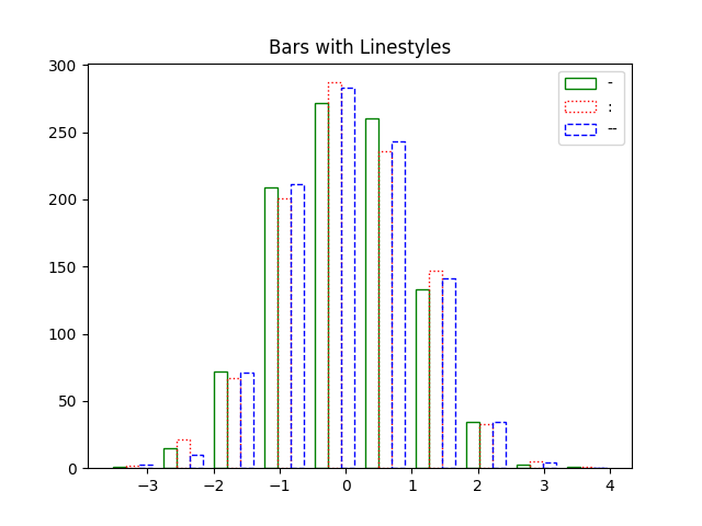
linestyle#
fig, ax = plt.subplots()

linestyles = ['-', ':', '--']

ax.hist(x, n_bins, fill=False, histtype='bar', linestyle=linestyles,
        edgecolor=edgecolors, label=linestyles)
ax.legend()
ax.set_title('Bars with Linestyles')

plt.show()
参考
以下函数,方法,类和模块的用法在本例中显示:
matplotlib.axes.Axes.hist/matplotlib.pyplot.hist
脚本的总运行时间:(0 分 2.156 秒)