备注
Go to the end 下载完整的示例代码.
在 Matplotlib 中选择颜色映射#
Matplotlib 有许多内置的颜色映射,可以通过 matplotlib.colormaps 访问.还有一些外部库也包含许多额外的颜色映射,可以在 Matplotlib 文档的 Third-party colormaps 部分中查看.这里我们简要讨论如何选择许多选项.有关创建您自己的颜色映射的帮助,请参阅 在 Matplotlib 中创建颜色映射 .
要获取所有已注册颜色映射的列表,您可以执行以下操作:
from matplotlib import colormaps
list(colormaps)
概述#
选择一个好的颜色映射背后的想法是在 3D 颜色空间中为您的数据集找到一个好的表示.任何给定数据集的最佳颜色映射取决于许多因素,包括:
是表示形式数据还是度量数据 ([Ware] )
您对数据集的了解(例如,是否存在一个关键值,其他值从中偏离?)
对于您正在绘制的参数,是否存在直观的配色方案
该领域中是否存在受众可能期望的标准
对于许多应用,感知均匀的颜色映射是最佳选择;也就是说,颜色映射中数据中的相等步长被感知为颜色空间中的相等步长.研究人员发现,人脑感知亮度参数的变化比感知例如色调的变化更好.因此,通过颜色映射具有单调增加亮度的颜色映射将被观众更好地解释.在 Third-party colormaps 部分中也可以找到感知均匀颜色映射的精彩示例.
颜色可以用各种方式表示在 3D 空间中.一种表示颜色的方法是使用 CIELAB.在 CIELAB 中,颜色空间由亮度 \(L^*\) ;红-绿 \(a^*\) ;和黄-蓝 \(b^*\) 表示.然后可以使用亮度参数 \(L^*\) 来了解更多关于 Matplotlib 颜色映射将如何被观众感知的信息.
学习关于人类对颜色图感知的优秀入门资源来自 [IBM].
颜色图的分类#
颜色图通常根据其功能分为几个类别(参见,例如 [Moreland] ):
顺序型(Sequential):亮度和颜色饱和度以递增方式变化,通常使用单一色调;应用于表示具有顺序的信息.
发散型(Diverging):两种不同颜色的亮度和可能饱和度发生变化,并在中间与一种不饱和颜色相遇;应用于绘制的信息具有关键中间值时,例如地形或数据围绕零值变化时.
循环型(Cyclic):两种不同颜色的亮度变化,在中间和开始/结束时都与不饱和颜色相遇;应用于在端点处环绕的值,例如相位角,风向或一天中的时间.
定性型(Qualitative):通常是各种颜色;应用于表示没有顺序或关系的信息.
from colorspacious import cspace_converter

import matplotlib.pyplot as plt
import numpy as np

import matplotlib as mpl
首先,我们将展示每个颜色图的范围.请注意,有些颜色图看起来比其他颜色图变化得"更快".
cmaps = {}

gradient = np.linspace(0, 1, 256)
gradient = np.vstack((gradient, gradient))


def plot_color_gradients(category, cmap_list):
    # Create figure and adjust figure height to number of colormaps
    nrows = len(cmap_list)
    figh = 0.35 + 0.15 + (nrows + (nrows - 1) * 0.1) * 0.22
    fig, axs = plt.subplots(nrows=nrows + 1, figsize=(6.4, figh))
    fig.subplots_adjust(top=1 - 0.35 / figh, bottom=0.15 / figh,
                        left=0.2, right=0.99)
    axs[0].set_title(f'{category} colormaps', fontsize=14)

    for ax, name in zip(axs, cmap_list):
        ax.imshow(gradient, aspect='auto', cmap=mpl.colormaps[name])
        ax.text(-0.01, 0.5, name, va='center', ha='right', fontsize=10,
                transform=ax.transAxes)

    # Turn off *all* ticks & spines, not just the ones with colormaps.
    for ax in axs:
        ax.set_axis_off()

    # Save colormap list for later.
    cmaps[category] = cmap_list
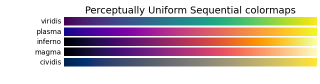
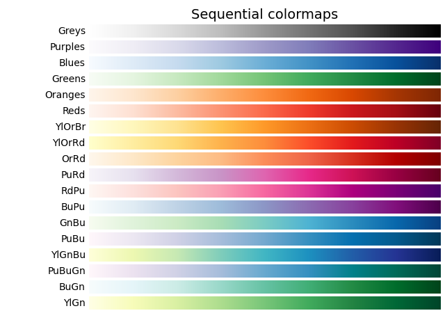
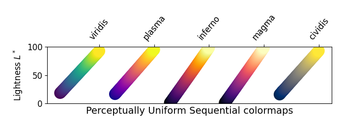
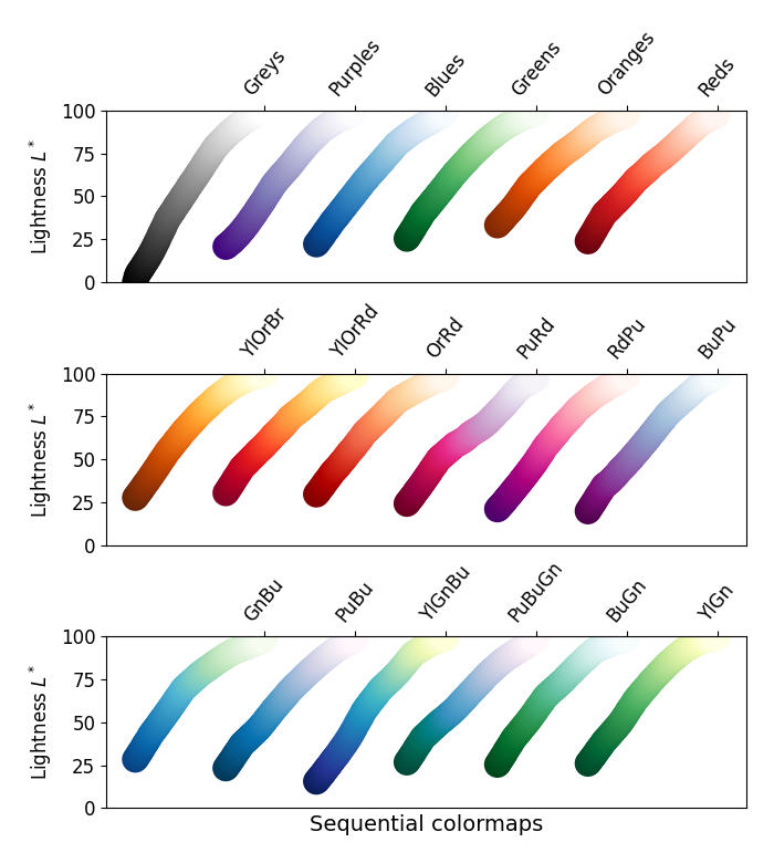
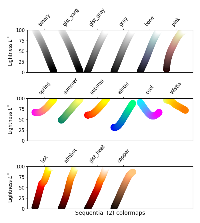
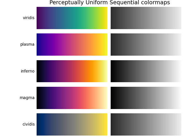
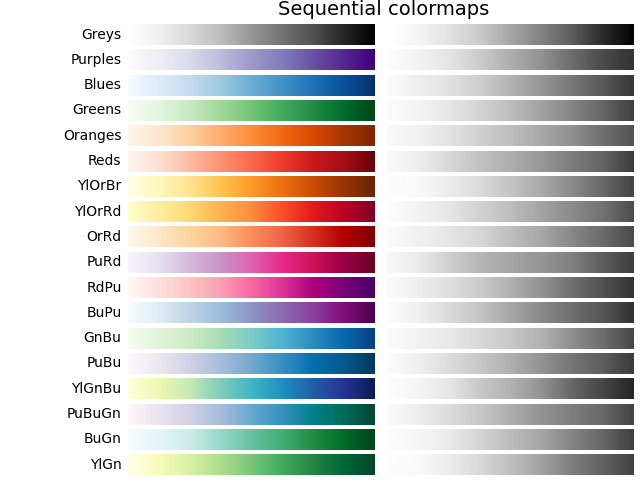
顺序型#
对于顺序型图,亮度值在整个颜色图中单调递增.这很好.颜色图中某些 \(L^*\) 值跨越 0 到 100(二进制和其他灰度),而另一些从 \(L^*=20\) 附近开始.那些 \(L^*\) 范围较小的颜色图将相应地具有较小的感知范围.另请注意, \(L^*\) 函数在颜色图之间变化:有些在 \(L^*\) 中近似线性,而另一些则更弯曲.
plot_color_gradients('Perceptually Uniform Sequential',
                     ['viridis', 'plasma', 'inferno', 'magma', 'cividis'])
plot_color_gradients('Sequential',
                     ['Greys', 'Purples', 'Blues', 'Greens', 'Oranges', 'Reds',
                      'YlOrBr', 'YlOrRd', 'OrRd', 'PuRd', 'RdPu', 'BuPu',
                      'GnBu', 'PuBu', 'YlGnBu', 'PuBuGn', 'BuGn', 'YlGn'])
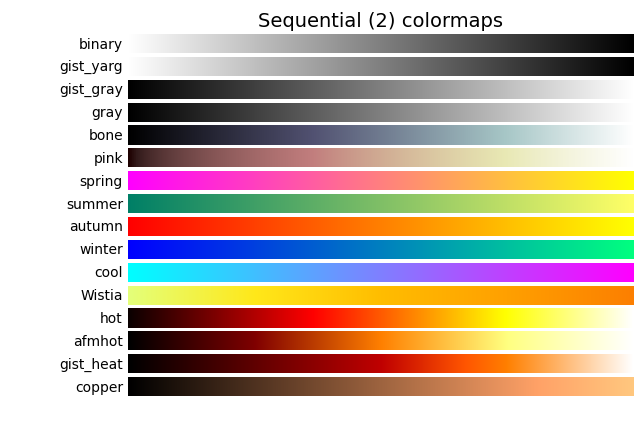
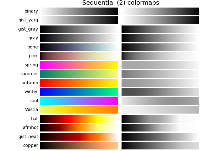
顺序型2#
来自顺序型2图的许多 \(L^*\) 值单调递增,但有些(autumn,cool,spring 和 winter)停滞甚至在 \(L^*\) 空间中上下波动.其他(afmhot,copper,gist_heat 和 hot)在 \(L^*\) 函数中存在扭结.在颜色图中停滞或扭结区域中表示的数据将导致在颜色图中那些值的数据出现条带化的感知(有关此方面的出色示例,请参见 [mycarta-banding] ).
plot_color_gradients('Sequential (2)',
                     ['binary', 'gist_yarg', 'gist_gray', 'gray', 'bone',
                      'pink', 'spring', 'summer', 'autumn', 'winter', 'cool',
                      'Wistia', 'hot', 'afmhot', 'gist_heat', 'copper'])
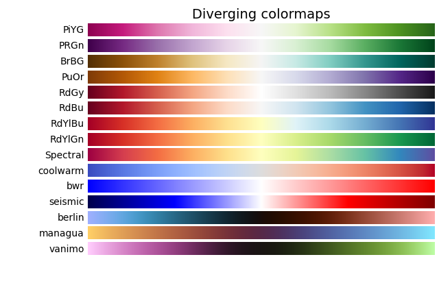
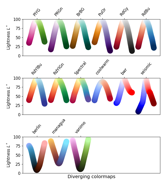
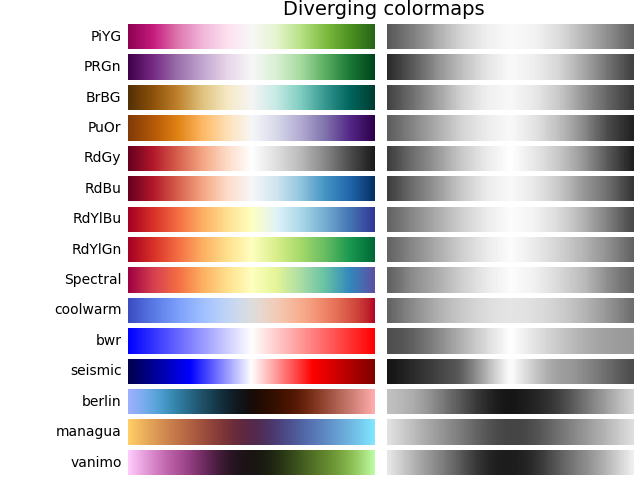
发散型#
对于发散型图,我们希望 \(L^*\) 值单调递增到最大值,该最大值应接近 \(L^*=100\) ,然后 \(L^*\) 值单调递减.我们正在寻找颜色图相反端大致相等的最小 \(L^*\) 值.通过这些衡量标准,BrBG 和 RdBu 是不错的选择.coolwarm 是一个不错的选择,但它没有跨越很宽的 \(L^*\) 值范围(请参见下面的灰度部分).
Berlin,Managua 和 Vanimo 是深色模式发散颜色图,中心亮度最小,两端亮度最大.这些取自 F. Crameri 的版本8.0.1 [scientific colour maps]_ .
plot_color_gradients('Diverging',
                     ['PiYG', 'PRGn', 'BrBG', 'PuOr', 'RdGy', 'RdBu', 'RdYlBu',
                      'RdYlGn', 'Spectral', 'coolwarm', 'bwr', 'seismic',
                      'berlin', 'managua', 'vanimo'])
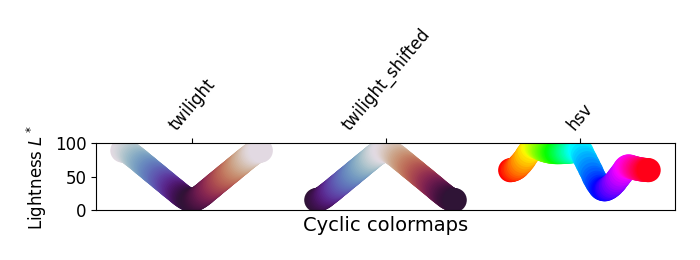
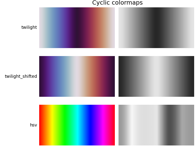
循环型#
对于循环图,我们希望从相同的颜色开始和结束,并在中间达到对称的中心点. \(L^*\) 应该从开始到中间单调变化,并从中间到结束反向变化.它在增加和减少的一侧应该是对称的,并且仅在色调上有所不同.在端点和中间, \(L^*\) 将反转方向,这应该在 \(L^*\) 空间中平滑,以减少伪影.有关循环图设计的更多信息,请参见 [kovesi-colormaps] .
常用的 HSV 颜色图包含在这组颜色图中,但它对于中心点不对称.此外, \(L^*\) 值在整个颜色图中差异很大,这使其成为表示数据以供观看者进行感知的不良选择.有关此想法的扩展,请参见 [mycarta-jet] .
plot_color_gradients('Cyclic', ['twilight', 'twilight_shifted', 'hsv'])

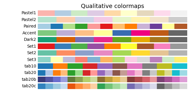
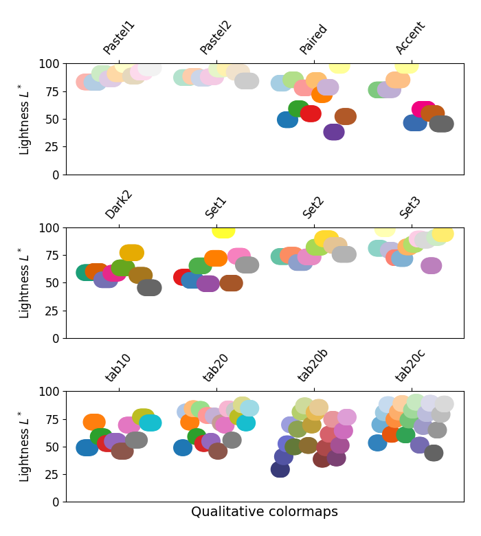
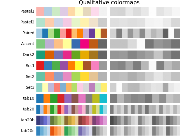
定性型#
定性颜色图的目的不是成为感知图,但查看亮度参数可以为我们验证这一点. \(L^*\) 值在整个颜色图中到处移动,并且显然不是单调递增的.这些不适合用作感知颜色图.
plot_color_gradients('Qualitative',
                     ['Pastel1', 'Pastel2', 'Paired', 'Accent', 'Dark2',
                      'Set1', 'Set2', 'Set3', 'tab10', 'tab20', 'tab20b',
                      'tab20c'])
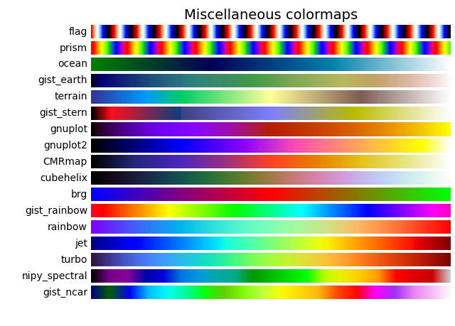
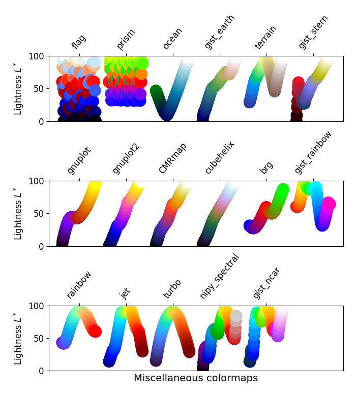
其他#
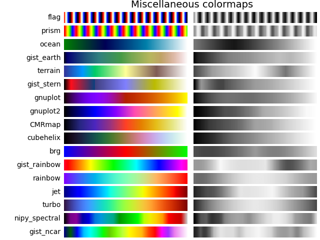
一些其他的颜色图具有为之创建的特定用途.例如,gist_earth,ocean 和 terrain 似乎都是为一起绘制地形(绿色/棕色)和水深(蓝色)而创建的.然后,我们希望在这些颜色图中看到一个发散,但多个扭结可能并不理想,例如在 gist_earth 和 terrain 中.创建 CMRmap 是为了很好地转换为灰度,尽管它似乎在 \(L^*\) 中有一些小的扭结. cubehelix 的创建是为了在亮度和色调上平滑变化,但似乎在绿色色调区域中有一个小的驼峰.turbo 的创建是为了显示深度和视差数据.
通常使用的 jet 色彩映射表包含在此色彩映射表集中.我们可以看到 \(L^*\) 值在整个色彩映射表中变化很大,这使得它成为一个糟糕的选择,无法以感知的方式向观看者呈现数据.有关此想法的扩展,请参见 [mycarta-jet] 和 [turbo].
plot_color_gradients('Miscellaneous',
                     ['flag', 'prism', 'ocean', 'gist_earth', 'terrain',
                      'gist_stern', 'gnuplot', 'gnuplot2', 'CMRmap',
                      'cubehelix', 'brg', 'gist_rainbow', 'rainbow', 'jet',
                      'turbo', 'nipy_spectral', 'gist_ncar'])

plt.show()
Matplotlib 色彩映射表的亮度#
在此,我们检查 Matplotlib 色彩映射表的亮度值.请注意,有关色彩映射表的一些文档可用([list-colormaps]).
mpl.rcParams.update({'font.size': 12})

# Number of colormap per subplot for particular cmap categories
_DSUBS = {'Perceptually Uniform Sequential': 5, 'Sequential': 6,
          'Sequential (2)': 6, 'Diverging': 6, 'Cyclic': 3,
          'Qualitative': 4, 'Miscellaneous': 6}

# Spacing between the colormaps of a subplot
_DC = {'Perceptually Uniform Sequential': 1.4, 'Sequential': 0.7,
       'Sequential (2)': 1.4, 'Diverging': 1.4, 'Cyclic': 1.4,
       'Qualitative': 1.4, 'Miscellaneous': 1.4}

# Indices to step through colormap
x = np.linspace(0.0, 1.0, 100)

# Do plot
for cmap_category, cmap_list in cmaps.items():

    # Do subplots so that colormaps have enough space.
    # Default is 6 colormaps per subplot.
    dsub = _DSUBS.get(cmap_category, 6)
    nsubplots = int(np.ceil(len(cmap_list) / dsub))

    # squeeze=False to handle similarly the case of a single subplot
    fig, axs = plt.subplots(nrows=nsubplots, squeeze=False,
                            figsize=(7, 2.6*nsubplots))

    for i, ax in enumerate(axs.flat):

        locs = []  # locations for text labels

        for j, cmap in enumerate(cmap_list[i*dsub:(i+1)*dsub]):

            # Get RGB values for colormap and convert the colormap in
            # CAM02-UCS colorspace.  lab[0, :, 0] is the lightness.
            rgb = mpl.colormaps[cmap](x)[np.newaxis, :, :3]
            lab = cspace_converter("sRGB1", "CAM02-UCS")(rgb)

            # Plot colormap L values.  Do separately for each category
            # so each plot can be pretty.  To make scatter markers change
            # color along plot:
            # https://stackoverflow.com/q/8202605/

            if cmap_category == 'Sequential':
                # These colormaps all start at high lightness, but we want them
                # reversed to look nice in the plot, so reverse the order.
                y_ = lab[0, ::-1, 0]
                c_ = x[::-1]
            else:
                y_ = lab[0, :, 0]
                c_ = x

            dc = _DC.get(cmap_category, 1.4)  # cmaps horizontal spacing
            ax.scatter(x + j*dc, y_, c=c_, cmap=cmap, s=300, linewidths=0.0)

            # Store locations for colormap labels
            if cmap_category in ('Perceptually Uniform Sequential',
                                 'Sequential'):
                locs.append(x[-1] + j*dc)
            elif cmap_category in ('Diverging', 'Qualitative', 'Cyclic',
                                   'Miscellaneous', 'Sequential (2)'):
                locs.append(x[int(x.size/2.)] + j*dc)

        # Set up the axis limits:
        #   * the 1st subplot is used as a reference for the x-axis limits
        #   * lightness values goes from 0 to 100 (y-axis limits)
        ax.set_xlim(axs[0, 0].get_xlim())
        ax.set_ylim(0.0, 100.0)

        # Set up labels for colormaps
        ax.xaxis.set_ticks_position('top')
        ticker = mpl.ticker.FixedLocator(locs)
        ax.xaxis.set_major_locator(ticker)
        formatter = mpl.ticker.FixedFormatter(cmap_list[i*dsub:(i+1)*dsub])
        ax.xaxis.set_major_formatter(formatter)
        ax.xaxis.set_tick_params(rotation=50)
        ax.set_ylabel('Lightness $L^*$', fontsize=12)

    ax.set_xlabel(cmap_category + ' colormaps', fontsize=14)

    fig.tight_layout(h_pad=0.0, pad=1.5)
    plt.show()
灰度转换#
对于彩色图的灰度转换,必须注意,因为它们可能会在黑白打印机上打印. 如果考虑不周,您的读者最终可能会得到难以辨认的图,因为灰度在整个色彩映射表中以不可预测的方式变化.
灰度转换以许多不同的方式完成 [bw] . 其中一些较好的方法使用像素的 rgb 值的线性组合,但根据我们感知颜色强度的程度进行加权. 转换为灰度的非线性方法是使用像素的 \(L^*\) 值. 一般来说,这个问题与感知地呈现信息所适用的原则类似; 也就是说,如果选择一个在 \(L^*\) 值中单调递增的色彩映射表,它将以合理的方式打印为灰度.
考虑到这一点,我们看到 Sequential 色彩映射表在灰度中具有合理的表示. 一些 Sequential2 色彩映射表具有足够好的灰度表示,但有些(autumn,spring,summer,winter)的灰度变化很小. 如果在绘图中使用了这样的色彩映射表,然后将该图打印为灰度,则大量信息可能会映射到相同的灰色值. Diverging 色彩映射表主要以外边缘的较深灰色变化到中间的白色. 有些(PuOr 和 seismic)在一侧具有明显较深的灰色,因此不是很对称. coolwarm 的灰度范围很小,并且会打印到更均匀的图中,从而丢失大量细节. 请注意,叠加的,带标签的轮廓可以帮助区分色彩映射表的一侧与另一侧,因为一旦将绘图打印为灰度,就无法使用颜色. 许多 Qualitative 和 Miscellaneous 色彩映射表,例如 Accent,hsv,jet 和 turbo,在整个色彩映射表中从较深到较浅再到较深的灰度变化. 这将使观看者无法解释打印为灰度后绘图中的信息.
mpl.rcParams.update({'font.size': 14})

# Indices to step through colormap.
x = np.linspace(0.0, 1.0, 100)

gradient = np.linspace(0, 1, 256)
gradient = np.vstack((gradient, gradient))


def plot_color_gradients(cmap_category, cmap_list):
    fig, axs = plt.subplots(nrows=len(cmap_list), ncols=2)
    fig.subplots_adjust(top=0.95, bottom=0.01, left=0.2, right=0.99,
                        wspace=0.05)
    fig.suptitle(cmap_category + ' colormaps', fontsize=14, y=1.0, x=0.6)

    for ax, name in zip(axs, cmap_list):

        # Get RGB values for colormap.
        rgb = mpl.colormaps[name](x)[np.newaxis, :, :3]

        # Get colormap in CAM02-UCS colorspace. We want the lightness.
        lab = cspace_converter("sRGB1", "CAM02-UCS")(rgb)
        L = lab[0, :, 0]
        L = np.float32(np.vstack((L, L, L)))

        ax[0].imshow(gradient, aspect='auto', cmap=mpl.colormaps[name])
        ax[1].imshow(L, aspect='auto', cmap='binary_r', vmin=0., vmax=100.)
        pos = list(ax[0].get_position().bounds)
        x_text = pos[0] - 0.01
        y_text = pos[1] + pos[3]/2.
        fig.text(x_text, y_text, name, va='center', ha='right', fontsize=10)

    # Turn off *all* ticks & spines, not just the ones with colormaps.
    for ax in axs.flat:
        ax.set_axis_off()

    plt.show()


for cmap_category, cmap_list in cmaps.items():

    plot_color_gradients(cmap_category, cmap_list)
色觉缺陷#
有大量关于色盲的信息可用(例如,[colorblindness]_ ). 此外,还有一些工具可以将图像转换为它们对于不同类型的色觉缺陷的样子.
最常见的色觉缺陷形式涉及区分红色和绿色. 因此,通常避免使用同时具有红色和绿色的色彩映射表将避免许多问题.
参考文献#
https://mycarta.wordpress.com/2012/10/06/the-rainbow-is-deadlong-live-the-rainbow-part-3/
脚本的总运行时间:(0 分钟 9.952 秒)